2.2 layout 
This section will be very familiar to readers of the booklet Design GUI with Morph, and it is a good idea to read its Layout components chapter beforehand.
Arranging a set of morphs is what the LinearLayoutMorph class
does. Therefore, it makes sense to define a new morph based on a layout
and then install a set of morphs into it. This is exactly what the
LabelGroup class of the Cuis-Smalltalk-UI package does.
2.2.1 Arrange visually 
This subclass of LinearLayoutMorph takes a collection of textual descriptions and morphs to arrange them in two columns of labels and morphs. The idea is to give a label to widgets presented in a view.
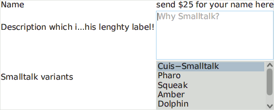
Figure 2.2: A group of three morphs, each with its own label
In one layout column, the label group arranges each label and widget pair in a row so that all the label cells are of the same width. What it takes is a collection of label and morph associations. The returned layout is to be added to a higher-level view.
LabelGroup class>>example1
^ self with: {
   'Name' -> (LabelMorph contents: 'send $25 for your name here').
   'Description which is very long...' -> (
      TextModelMorph withText: '' :: emptyTextDisplayMessage: 'Why Smalltalk?').
   'Smalltalk variants' -> (
      PluggableListMorph
         withModel: (ListModel with: #('Cuis-Smalltalk' 'Pharo' 'Squeak' 'Amber'))
         listGetter: #list
         indexGetter: #listIndex
         indexSetter: #listIndex: )} ::
      color: Color white paler ;
yourself
The LabelGroup is a passive object; its only purpose is to arrange morphs visually. All user interactions are managed by the widgets. However, in some circumstances, we want both to arrange widgets and to be notified about specific user interactions. This is what the CheckGroup and RadioGroup classes do.
2.2.2 Be notified 
Once morphs are arranged in a layout, it makes sense to be notified through events when the user interacts with some of the arranged morphs. From this perspective, the LabelGroup class is absolutely passive, unlike the CheckGroup class, which we will present now.
As a LabelGroup, a CheckGroup presents a collection of labels with associated widgets, here CheckButtonMorph. In a CheckGroup, zero or more CheckButtonMorph can be selected at once. In a RadioGroup, a subclass, only one RadioButtonMorph is selected at once.
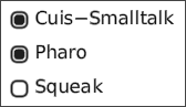
Figure 2.3: A check group to select among the baby squeaks
Creating a check group only requires a collection of labels3:
CheckGroup class>>example1
| group |
group := self fromList: #('Cuis-Smalltalk' 'Pharo' 'Squeak').
group buttons do: [:each |
   each when: #checkSelection send: #show: to: Transcript].
^ group
In the example, the #checkSelection event emitted by each check button is captured for reporting purposes. The attentive reader will observe that this event is not specific to the check group. Indeed, the check group itself emits another specific event, #informCheckSelection, when a button is selected:
CheckGroup>>newSelection: radioButton
" Inform we have a new selection "
self triggerEvent: #informCheckSelection with: (self symbolForButton: radioButton)
The event is triggered with the button label as an attribute. To observe its use, experiment with the method CheckGroup class>>example2.