4.3 Text Entry 
The TextModelMorph class can be used for single or multiple line text input. It is a very important and complex class with a lot of features:
- Input field. Single line or multiple lines.
- Code editing. Syntax formatting and coloring, code completion.
- Style. Text colors and attributes such as bold, italic, underlined, etc.
- Font. TrueType font selection with various sizes.
- Paragraph. Text alignment.
The following code creates an instance of TextModelMorph, changes its value, and prints its value:
textEntry := TextModelMorph withText: 'initial content'.
textEntry openInWorld.
textEntry editor actualContents: 'new content'.
textEntry text print
Example 4.8: Simple text entry
Typically, you will want to modify many aspects of this morph such as its size and whether words automatically wrap to new lines. By default, words that would extend past the right side wrap to the next line. To prevent wrapping:
textEntry wrapFlag: false
The value associated with a TextModelMorph is either held in a TextModel object or a Text object.
There are three common ways to create an instance of TextModelMorph. The choice is based on how the initial value is supplied and where the current value is held.
- TextModelMorph withText: aTextOrString
This creates a TextModel object that is initialized with the given value, passes it to the next method, and returns what that returns.
- TextModelMorph withModel: aTextModel
This approach allows the same TextModel to be used by multiple other morphs. It creates an instance, sets its model to a TextModel, and returns the instance. With this approach, when a TextModel sees its contents changed, it informs its view about the change:
actualContents: aTextOrString
self basicActualContents: aTextOrString.
self changed: #actualContents
And a TextModelMorph listens to such changes to update itself:
update: aSymbol
super update: aSymbol.
aSymbol ifNil: [ ^self].
...
aSymbol == #actualContents ifTrue: [ ^self updateActualContents ].
...
- TextModelMorph textProvider: aTextProvider textGetter: getTextSel textSetter: setTextSel
This approach allows the value to be maintained in any object, aTextProvider, that responds to the given selectors to provide the text with its getter and to update its text attribute from the text entry with its setter. Underneath, it wraps the text provider in a PluggableTextModel, which is then the model of the text entry 5.
When a change is notified by the text provider:
TextProvider >> aMethodDoingSomething
...
self changed: #getterSymbol.
...
The pluggable model receives an update which in turn notifies of the change:
PluggableTextModel >> update: aSymbol
...
aSymbol == textGetter ifTrue: [ ^self changed: #acceptedContents ].
aSymbol == selectionGetter ifTrue: [ ^self changed: #initialSelection ].
self changed: aSymbol
Propagated to the text entry to update itself (method partial shown above):
update: aSymbol
...
aSymbol == #acceptedContents ifTrue: [ ^self updateAcceptedContents ].
...
Beware, the behavior of updateAcceptedContents may be altered by the status of hasUnacceptedEdits attributes. When true, it may prevent the update of the text entry from other means when the user has previously keyed-in text. In case of doubt, try to set this attribute to false: textEntry hasUnacceptedEdits: false.
To display prompting text inside a TextModelMorph until the user begins typing a value, send it the message #emptyTextDisplayMessage: with a string argument.
The default background color of a TextModelMorph is white. A TextModelMorph only displays a border when it has focus. One way to make its bounds apparent when it doesn’t have focus is to set the background color of the parent component.
textEntry owner color: (Color blue alpha: 0.1)
Another way is to set the background color of the TextModelMorph.
textEntry color: (Color blue alpha: 0.1)
By default, when there are more lines than fit in the height, a vertical scroll bar appears. When wrapping is turned off, if the text does not fit in the width, then a horizontal scroll bar appears. To prevent scroll bars from appearing, send the following message to an instance #hideScrollBarsIndefinitely.
The default size of a TextModelMorph is 200 by 100. This is set in the initialize method of PluggableMorph, which is the superclass of PluggableScrollPane, which is the superclass of TextModelMorph. Depending on the font, the default size displays around four lines of wrapping text with around 17 characters per line. To change the size:
textEntry morphExtent: width @ height
The size should include space for scroll bars if they may be needed. Setting the height to zero causes it to actually be set to the height required for a single line in the current font.
By default, pressing the tab key does not move focus from one TextModelMorph instance to another. To enable this, do the following for each instance:
textEntry tabToFocus: true
When the user changes the text in a TextModelMorph, the object that holds its value is not automatically updated. To manually request the update:
textEntry scroller acceptContents
There are multiple ways to configure user actions to trigger an update in the model, a text provider or a text model as described previously. The easiest are:
textEntry acceptOnAny: true. "updates after every keystroke"
textEntry acceptOnCR: true. "updates after return key is pressed"
To listen for changes to the value of a TextModelMorph:
textEntry keystrokeAction: [:event |
    | value |
    value := textEntry text.
    "Do something with the value."]
By default, if the user attempts to close a SystemWindow and it contains TextModelMorph instances that have unsaved changes, they are asked to confirm this with the message "Changes have not been saved. Is it OK to cancel those changes?" The user must select "Yes" to close the window.
To disable this check for a particular instance of TextModelMorph, send it #askBeforeDiscardingEdits: with the argument false.
The following code creates a single-line text input with a given width that never shows scroll bars:
textEntry := TextModelMorph withText: '' ::
    hideScrollBarsIndefinitely;
    morphExtent: 200 @ 0; "calculates required height for one line"
    wrapFlag: false.
If the text exceeds the width, use the left and right arrow keys to scroll the text.
To select all the content in an instance, send it #selectAll. To select content from one index to another where both are inclusive:
textEntry selectFrom: startIndex to: endIndex.
To place the text cursor at the end of the current content:
index := textEntry text size + 1.
textEntry selectFrom: index to: index.
The following code demonstrates listening for key events. It prints their ASCII codes and character representations to the Transcript.
textEntry keystrokeAction: [:evt |
   evt keyValue print.
   evt keyCharacter print ]
Let’s combine what we have learned above to create a small application. The user can enter their first and last name. Clicking the "Greet" button displays a greeting message below the button.
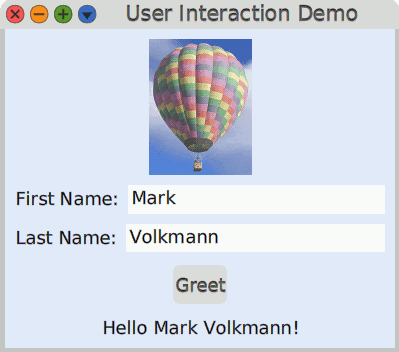
Figure 4.11: User Interaction Demo
Create the class UserInteractionDemo as follows:
Object subclass: #UserInteractionDemo
    instanceVariableNames: 'firstName greetLabel lastName'
    classVariableNames: ''
    poolDictionaries: ''
    category: 'Demo'
Define the following accessor methods:
firstName
^ firstName ifNil: [firstName := '']
firstName: aString
firstName := aString
…
As we need two input fields, we define the instance method textEntryOn:
textEntryOn: aSymbol
"Answer a TextModelMorph where aSymbol provides the name for the getter and setter."
| entry |
entry := TextModelMorph textProvider: self textGetter: aSymbol textSetter: (aSymbol, ':') asSymbol ::
   acceptOnAny: true; " The model is updated at each key stroke "
   askBeforeDiscardingEdits: false;
   hideScrollBarsIndefinitely;
   " Height to zero causes it to use minimum height for one line. "
   morphExtent: 0 @ 0;
   tabToFocus: true;
   wrapFlag: false.
entry layoutSpec proportionalWidth: 1. "width is 100%"
^ entry
Our text entries are then packed in a row with the appropriate label:
rowLabeled: aString for: aMorph
"Answer a row LayoutMorph containing a LabelMorph and a given morph."
| row |
row := LayoutMorph newRow ::
   gap: 10;
   addMorph: (LabelMorph contents: aString);
   addMorph: aMorph.
row layoutSpec proportionalHeight: 0.
^ row
We define an action method for the only button in our small application:
greet
| greeting |
greeting := firstName
   ifEmpty: ['']
   ifNotEmpty: [ 'Hello {1} {2}!' format: {firstName. lastName} ].
greetLabel contents: greeting
Finally, our initialize method packs all the involved morphs together:
initialize
| button image window |

"Relative file paths start from the Cuis-Smalltalk-Dev-UserFiles directory."
image := ImageMorph newWith: (Form fromFileNamed: './hot-air-balloon.png' ::
   magnifyBy: 0.5).
button := PluggableButtonMorph model: self action: #greet label: 'Greet'.
greetLabel := LabelMorph contents: ''.

window := SystemWindow new ::
   setLabel: 'User Interaction Demo';
   addMorph: image;
   addMorph: (self rowLabeled: 'First Name:' for: (self textEntryOn: #firstName));
   addMorph: (self rowLabeled: 'Last Name:' for: (self textEntryOn: #lastName));
   addMorph: button;
   addMorph: greetLabel;
   openInWorld.

" Once the window is open and properly laid out,  we adjust its size
  to the smallest height that contains its submorphs."
window morphExtent: 400 @ window minimumExtent y.

" Override the automatic Window color scheme "
window layoutMorph
   separation: 10;
   color: (Color blue alpha: 0.1)
In Which Components? Where to Find More?, you will learn how to use additional Cuis-Smalltalk packages to ease the creation of such dialog windows.