6.3 Additional Features 
In the next sections, we present a very small selection of useful components. There are many more to explore in the repository; they all come with example methods to learn from, found on their class side.
6.3.1 Radio and Check Buttons 
These widgets are found in the UI-Click-Select package.
In a GUI, a check button represents a boolean value. They are used in groups with a text label or any kind of morph to represent its iconic representation.
| column group |
column := LayoutMorph newColumn.
group := CheckGroup fromList: #('Cuis' 'Pharo' 'Squeak').
group buttons do: [:each | each when: #checkSelection send: #show: to: Transcript].
column
   addMorph: (LabelMorph contents: 'I use...' bold);
   addMorph: group.
column openInWorld
Example 6.5: Check group
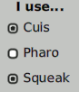
Figure 6.8: A group of check buttons
To meaningfully manage the check and uncheck events, different action methods can be set for each check box. The previous example could be rewritten:
...
cuisCheck := [:check |
   check isSelected
   ifTrue: ['I use Cuis' print] ifFalse: ['I don''t use Cuis' print] ] .
group buttons first
   when: #checkSelection
   send: #value:
   to: cuisCheck.
...
Do not add the cuisCheck variable to the declaration at the first line of the script; otherwise, it will be garbage collected. Indeed, an action event is weakly referenced – i.e., it does not add a count to its reference use. Of course, in an application, you will use a method selector as the argument of the #to: keyword.
In a radio button group, only one button is selected at a time. When a new button is selected, the previously selected button is deselected. A radio button is drawn differently, as a circle. We can alter our previous greeting dialog to add a radio button group to select a preferred color:
newPane
| column group radioColors |
...
radioColors := RadioGroup fromList: #(Blue White Red).
radioColors when: #informRadioSelection send: #setColor: to: self.
column
   addMorph: group layoutSpec: (LayoutSpec  fixedWidth: 300);
   addMorph: radioColors beRow;
...
And the associated action method:
setColor: aColorSymbol
self color: (Color perform: aColorSymbol asLowercase asSymbol)
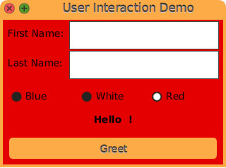
Figure 6.9: Our enhanced dialog to select color with radio buttons
6.3.2 Drop Down Button 
A drop-down button is a button whose content is selected from a drop-down list. When the user clicks such a button, a menu is displayed below the button. The content of the list is textual when using the class DropDownListMorph, or it can be any kind of morph when using the class DropDownButtonMorph.
We can add a drop-down button to let the user select an icon to decorate our greeting dialog. We adjust our existing code to add an image morph to the pane and the drop-down button:
newPane
| column group radioColors |
...
   'Last Name: ' -> (lastName := TextEntryMorph contents: '').
   'Preferred icon: ' -> self dropDownIcons }.
...
column
   addMorph: (myImage := ImageMorph new);
   addMorph: group layoutSpec: (LayoutSpec  fixedWidth: 300);
...
The creation of the button is delegated to another method:
dropDownIcons
| morphs listModel |
morphs := #(addressBookIcon chatIcon clockIcon doItIcon findIcon) collect: [:anIcon |
   ImageMorph new ::
      image: ((Theme current perform: anIcon) magnifyTo: 32@32) ].
listModel := ListModel with: morphs.
listModel when: #listSelectionChanged send: #updateIcon: to: self.
^ DropDownButtonMorph
   withModel: listModel listGetter: #list indexGetter: #listIndex indexSetter: #listIndex:
We create a collection of image morphs, each with a different icon. We use a ListModel to hold the collection and trigger events when the list selection is changed. In that circumstance, the message #updateIcon: is sent to the dialog with the list model as the argument; this method is straightforward:
updateIcon: aListModel
myImage image: aListModel selectedItem form
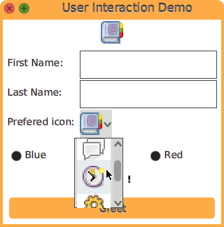
Figure 6.10: A Drop down button of image morphs
It is possible to use an application model instead of a ListModel. In that circumstance, the associated getter and setter would be implemented in this model too.
6.3.3 Decorating Component 
Decorating a component is a nice way to set a label around one or more widgets, but it is much more than that. The decorated components are highlighted with a surrounding line and a textual label, plus an optional list of quick buttons. The quick buttons can be anything to operate on the surrounded components.
The class DecoratedPane is part of the UI-Panel; it is likely already installed on your Cuis-Smalltalk system if you followed along with the previous sections of this booklet. A decorated pane expects a morph to decorate, a string, and an optional collection of buttons:
(DecoratedPane
   open: (Sample03Smiley new)
   label: 'Be Happy') openInWorld
Example 6.6: Decorating a morph
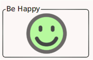
Figure 6.11: A smiley decorated with a ’Be Happy’ slogan
Let’s go back to our greeting panel and decorate the greetLabel with an information label and two quick buttons: one to reset the greeting and a second one to greet the author of the running Cuis-Smalltalk image. We need to edit our newPane method again:
newPane
| column group radioColors decorator |
...
greetLabel := LabelMorph contents: '' font: nil emphasis: 1.
decorator := DecoratedPane
   open: greetLabel
   label: 'Decorated Label'
   quickButtons: {
      PluggableButtonMorph
         model: [greetLabel contents: 'Hello ', Utilities authorName] action: #value ::
         icon: (Theme current fetch: #('16x16' 'actions' 'contact-new')) ;
         setBalloonText: 'Say hello to the Smalltalk author of this running Cuis image.' .
      PluggableButtonMorph
         model: [greetLabel contents: ''] action: #value ::
         icon: (Theme current fetch: #('16x16' 'actions' 'edit-clear'));
         setBalloonText: 'Take back my greeting.' }.
...
Then, in the column morph, we add the decorator instead of the greetLabel:
newPane
...
column
   ...
   addMorph: radioColors beRow;
   addMorph: decorator.
...
Observe the PluggableButtonMorph; we use BlockClosure as a model and the message #value as the action to get it executed on the button click. In a real application, you will more likely use an instance as a model and an associated method of its protocol.
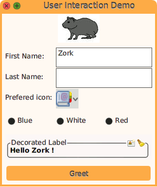
Figure 6.12: The greeting label decorated with two quick buttons
6.3.4 Importing Icons 
Icons are important when designing GUIs. Cuis-Smalltalk comes with a few sets
of icons. Explore the icons method category of the
Theme class; each of these methods returns a Form to use
as an icon in a PluggableButtonMorph.
PluggableButtonMorph
   model: self action: #close ::
   icon: Theme current closeIcon
There are additional icons found in ContentPack instances. Invoke an explorer on Theme content13 to browse those packs:
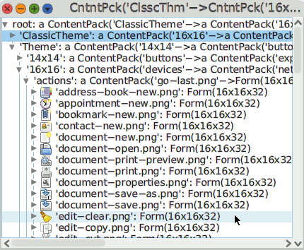
Figure 6.13: Content packs in Cuis-Smalltalk
To use one particular icon of a given content pack, you specify its size, the name of the content pack it belongs to, and the icon name without the file extension:
Theme current fetch: #('16x16' 'actions' 'appointment-new')
Several icons come with a shortcut found in the Theme class. Alternatively you may want to use your own icons; this is where you use the IconImporter class:
Feature require: 'UI-Graphic-Import'
Beware, it installs the SVG package too and its dependencies. It lets you import both PNG and SVG graphic files and scale them to different square sizes. You create an instance with a path where to search for the icons:
icons := IconImporter path: '/home/dev/Dynamic-Book/icons'
Then you ask for a Form or an ImageMorph of a given icon. To use the file group.svg located in '/home/dev/Dynamic-Book/icons' as an icon, and to scale it as a 32x32 pixel form, you write:
icons getForm: #group32
Or to request an image morph for direct use in your own GUI:
(icons getMorph: #group32) openInHand

Figure 6.14: Request an ImageMorph from a graphic file
The requested icons of a given size are cached in the icon importer; later requests for the same icon and size have a minimal processing cost.
There are several options to explore in IconImporter, particularly when you need to adjust the icon size to the screen density:
" to request an icon with a size set at execution time "
icons getForm: #group ofSize: MyApp iconSize.

" to open an image morph with the given icon "
(icons getMorph: #group ofSize: 64) openInWorld
With MyApp deducing the iconSize from user preferences.
When dealing with SVG graphics, monochrome icons may be painted with a given color:
icons getForm: #group ofSize: 64 fill: Color red

Figure 6.15: Get a picture as an icon and paint it in red