6.2 Easing GUI Design 
Let’s start the exploration with a few components to ease the creation of a GUI.
6.2.1 Label That Squeezes 
Sometimes, labels may tend to occupy more space than is available. This becomes particularly true when you do not control the content of a label, such as when an application is translated into other languages, which may have more or less verbose ways of expressing messages or concepts.
The SqueezeLabelMorph tries its best to contract a message into a given number of characters. It is part of the UI-Core.pck.st package. In a Workspace, install it by executing the appropriate command:
Feature require: 'UI-Core'
This kind of label is set with a minimum number of characters it is willing to display. If that minimum number is lower than the label’s content, it will contract the text:
(SqueezeLabelMorph
   contents: 'I am a very looong label with possibly not enough room for my characters'
   minCharsToShow: 20) openInWorld.
Example 6.1: Label that squeezes
The content of the label above is longer than the value of minCharsToShow: which we have set to 20 characters. Observe how such a squeezed label reveals its complete content in the balloon text when the pointer is hovering over it, and how capitalization of words occurs to make the contracted label easier to comprehend.
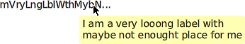
Figure 6.1: A label squeezed to 20 characters
When more space is made available to the label, more characters are revealed:

Figure 6.2: A squeezed label given some more space
Packing a SqueezeLabelMorph in a layout morph with other morphs will affect the minimal width of the owner layout.
Compare the two examples that follow, one with a squeezed label, and one with a regular label:
| label row |
label := SqueezeLabelMorph
	contents: 'I am a very long label'
	minCharsToShow: 15.
row := LayoutMorph newRow.
row
   addMorph: label;
   addMorph: (TextModelMorph withText: 'some input' :: morphExtent: 100@0).
row openInWorld
Example 6.2: Squeezed label for a text entry
The whole layout is contracted to a smaller width.
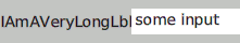
Figure 6.3: A text entry with a squeezed label
Now compare this to a regular label use case:
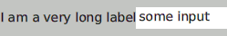
Figure 6.4: A text entry with a regular label
| row |
row := LayoutMorph newRow.
row
   addMorph: (LabelMorph contents: 'I am a very long label');
   addMorph: (TextModelMorph withText: 'some input' :: morphExtent: 100@0).
row openInWorld
Example 6.3: Regular label for a text entry
It is up to you to decide between compactness of the GUI and readability of the labels.
6.2.2 One Line Entry 
In Text Entry, we presented a quite complex and feature-complete class to handle multiple lines of text editing. That’s a bit overkill when only one line of editing is needed. In that circumstance, you can alternatively use the TextEntryMorph, part of the UI-Entry package:
Feature require: 'UI-Entry'
This class is quite simple, and contrary to the TextModelMorph, it does not need a text model. Therefore, there is no changed/update mechanism involved; it is a passive morph.
However, it offers two options to interact with other objects:
- Send it the message #acceptCancelReceiver: to attach an object answering to the #accept and #cancel messages when the Enter or Esc keys are pressed.
- Send it the message #crAction: to set a block of code, with no argument, to be executed when the Enter key is pressed.
Let’s experiment with the associated object answering to the #accept and #cancel messages. We need a TextEntryDemo class:
Object subclass: #TextEntryDemo
   instanceVariableNames: 'value entry'
   classVariableNames: ''
   poolDictionaries: ''
   category: 'DesignGUI-Booklet'
At initialization time, we create all the needed objects:
initialize
value := '42'.
entry := TextEntryMorph contents: value.
entry acceptCancelReceiver: self.
entry openInWorld
Now we make our TextEntryDemo respond to the #accept and #cancel messages. When pressing Enter, we update our value attribute:
accept
value := entry contents.
'I accepted the input ' print.
('value = ', value) print
But when pressing Esc, we just delete the morph:
cancel
'I discarded the input' print.
entry delete
Observe that we only need the accessors #contents/#contents: to set and retrieve its content. It is a very simple class to use. If dependency mechanisms were needed, an intermediate object such as the TextEntryDemo can still be used with the observer pattern.
6.2.3 Labelling Widget 
In our User Interaction Demo, we used a layout to associate a text entry with a label; a very common task when building a GUI. The LabelGroup does exactly that for an arbitrary number of morphs.
Feature require: 'UI-Widgets'
When creating a LabelGroup, we associate labels and widgets/controls into a unique group. In return, the user gets a layout to be inserted in a dialog or a window.
(LabelGroup with: {
'First Name:' -> TextEntryMorph new.
'Last Name:' -> TextEntryMorph new}) openInWorld
Example 6.4: Labelling a group of morphs
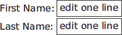
Figure 6.5: Text entries associated with labels
The label group also gives access to the controls, although it is not a very efficient way to access the input widgets used in the group; it is handy.
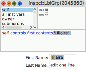
Figure 6.6: Access to the controls of a label group
A label group is useful when constructing small dialogs. In the next section, we build one with the morphs we learned in this and the previous sections.
6.2.4 Packing in Panel & Dialog 
Small windows the user interacts with are called dialogs or panels. Cuis-Smalltalk-UI offers several alternatives to use.
Feature require: 'UI-Panel'
Let’s rewrite our User Interaction Demo with what we just learned. The end result will look like this:
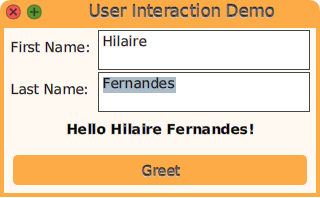
Figure 6.7: A greeting dialog
In the hierarchy provided by the UI-Panel package, we use the DialogPanel class. It offers both an area to plug in our interactive components and an area for our buttons.
DialogPanel subclass: #GreetingPanel
   instanceVariableNames: 'firstName lastName greetLabel'
   classVariableNames: ''
   poolDictionaries: ''
   category: 'DesignGUI-Booklet'
We set the default color of the dialog:
defaultColor
^ `Color lightOrange`
Then install the iconic buttons for its title:
initialize
super initialize.
self showButtonsNamed: #(close expand)
To learn about the available buttons for the title bar of a panel, read the class WindowTitleMorph. The expand action needs a rewrite of its associated action:
expandButtonClicked
self fullScreen
We set our components in the dedicated newPane method of the Dialog hierarchy:
newPane
| column group |
column := LayoutMorph newColumn ::
   color: Color transparent;
   gap: 10 .
group := LabelGroup with: {
   'First Name: ' -> (firstName := TextEntryMorph contents: '') .
   'Last Name: ' -> (lastName := TextEntryMorph contents: '') }.
greetLabel := LabelMorph contents: '' font: nil emphasis: 1.
column
   addMorph: group layoutSpec: (LayoutSpec fixedWidth: 300);
   addMorph: greetLabel layoutSpec: (
      LayoutSpec proportionalWidth: 0 fixedHeight: 20 offAxisEdgeWeight: #center).
^ column
The button also has its own method for installation:
newButtonArea
^ PluggableButtonMorph model: self action: #greet label: 'Greet' ::
   color: self widgetsColor
Finally, we implement the greet action of the button to update the greetLabel:
greet
greetLabel contents: (
   'Hello {1} {2}!' format: {firstName contents. lastName contents})